For ease of use, the settings section is divided into five sections:
Designer Settings
This is where you configure how the Design Editor performs on your store.
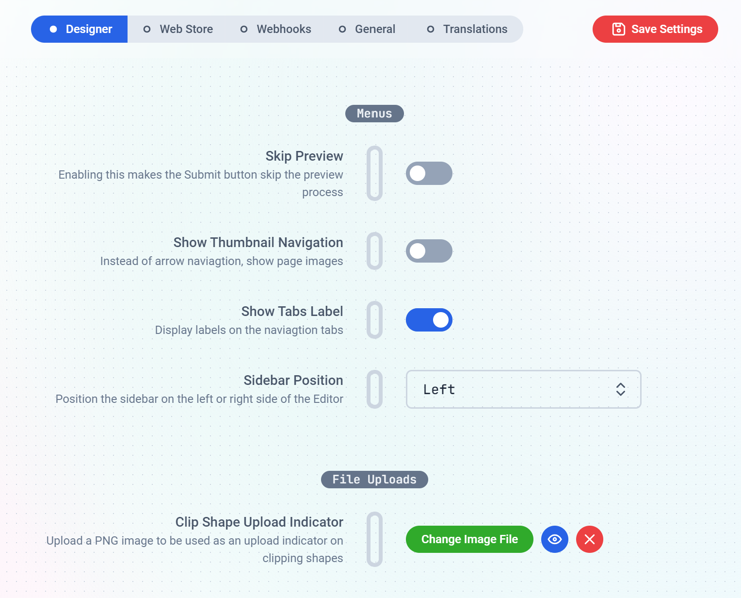
The Menus sub-section is where you make the editor to Skip previews when a customer clicks the preview button, place the
side bar on the left or right hand side of the window, etc. We have short descriptions against each menu to hint you on what they do.
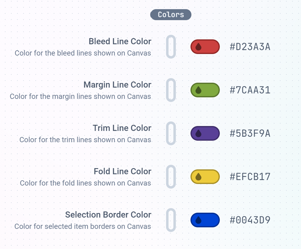
You also get to handle file uploads and the colors of the Designer interface.
Things like Bleed, Margin, Trim, Fold and Border lines color can all be uniquely set here to your taste.
The Text sub-section is where you set the default behaviour of Text elements when placed on the canvas. The default Text
content to show, type of Textbox whether wrapping or expandable text.
Auto place New Text when enabled, places the text directly on the canvas when the customer clicks the text button.
When disabled, the customer needs to click on a specific area on the canvas where they will like the text to be positioned.
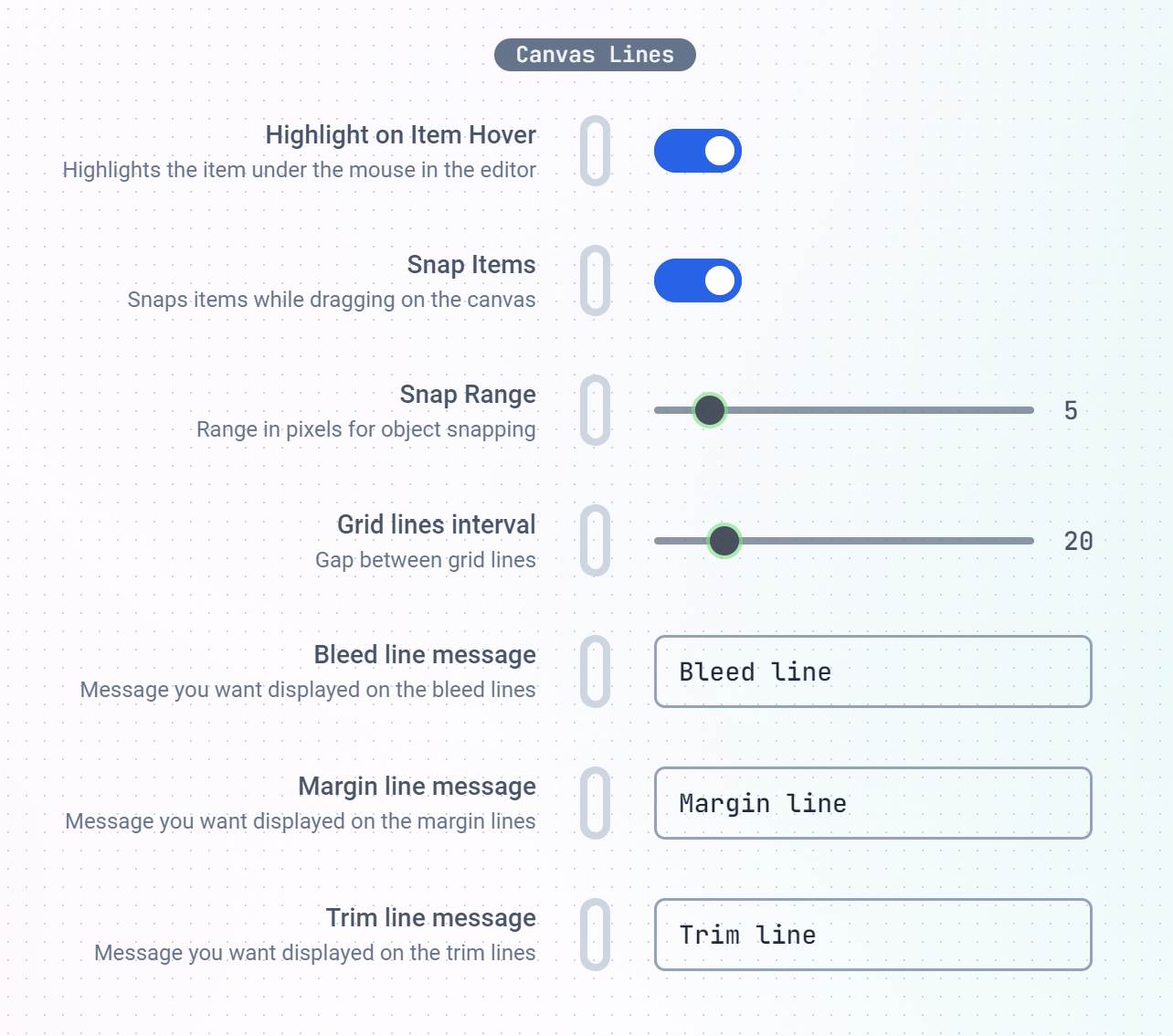
Canvas Lines are guide lines drawn to aid the customer while designing on the canvas. You can set their behaviours here
as well as guide messages to let the customer know what each line means or represents.
This is where you can set the Snapping range, Grid line intervals, Bleed, Margin and Trim line hints.
The Projects sub-section is where you can set the lifetime of customer-created projects as well as enable auto-save feature on the Designer.
Store Settings
Here, you get to configure how the Editor integrates with your WebStore.
Enabling the Retain Product Images feature makes the app to NOT swap your product images with the customized
previews when your customer finishes their customization.
Force Customization will hide your Add to Cart button until the buyer creates a customization.
If this feature does not work on your store,
it most likely means your store theme is unique and we may need to set the add to cart button selector for your store.
Please do reach out.
If this feature does not work on your store,
it most likely means your store theme is unique and we may need to set the add to cart button selector for your store.
Please do reach out.
Webhooks
Use the Webhooks to get notified when certain events happen on your store. Currently, we have Project Created and File Uploaded.
When a new Project is created or your customers uploads a file, you can provide a URL for us to call and deliver the notification to.
This can be used with external services like Zapier or Make to send project files to your Print service provider
or even delivered to you by mail.
General Settings
This features general settings related to the editor’s look and feel.
We have the editor theme: Light, Dark and System presets.
Here, you can also set the Sidebar color and the image displayed on modal popups.
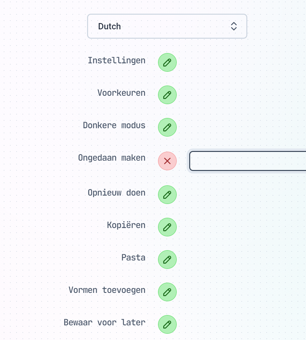
Custom Language Translations
Print.App supports over 80 languages. However, we utilize artificial intellegence (AI) to achieve these translations and
and in some instances, the translations doesn’t sit well with your specific requirements. This is where you can
make custom Language Adjustments to all of the texts displayed in the Designer.
To make a Custom Translation, simply select the Language from the drop-down list and scroll down to the specific wording you will like to change.
Click the Green Icon button next to it and provide your own unique translation.
Save the settings and check your store to see your specific wordings displayed.